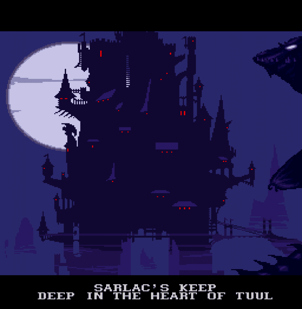
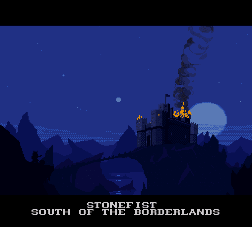
“An arch was never invented in the oppressed kingdom of Sarlac.”
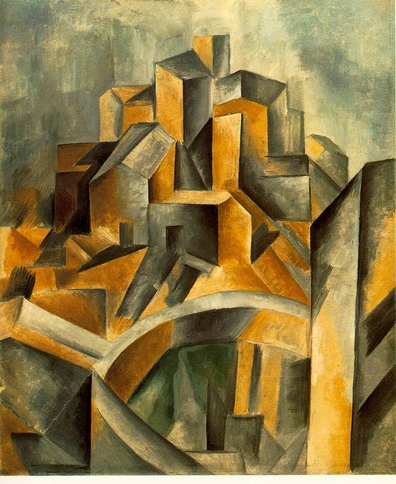
 BlackThorne (Blizzard; 1994) is a Cubist’s Waste Excretion. As such, it is unjustifiable spending much time writing about this game except in teasing out what we can learn from its failures. In Cubism (Fathered by Picasso) objects are portrayed abstracted in new ways from different angles; different planes of vision scrawl across the flat surface of the image portraying all angles physically and emotionally on a flat plane. This results in an abundance of right angles, straight lines, and contrasting edges and geometric constructions. Cubism attempts to analyze and study an object by deconstructing dimension into flatness.
In theory, a cubist game seems taylor made for the Super Nintendo Entertainment System (SNES), which portrays everything in 2D. SNES is the flat medium for games; all its games are anti-sculpture, non 3D, and thus a true Cubist success would really break the mold of the medium. The proposed success is not BlackThorne. Blackthorne is subcutaneously cubist in design yet only because of the utter incompetence and accident of its artists who have apparently never drawn a curvy object. Take a walk through BlackThorne and marvel at the ugliness and oppressiveness of its rectangles.
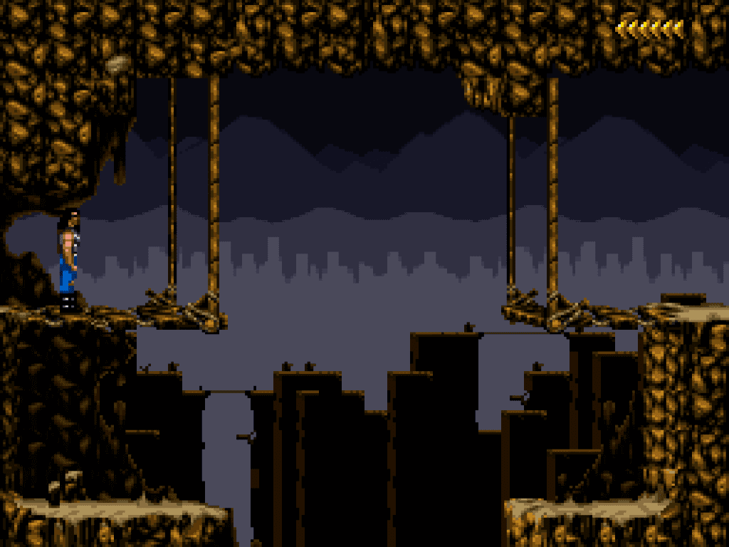
This image is characteristic of every traversable region of the Blackthorne universe. In the Background we see a rectangular cityscape. Closer up we see rectangular mountains with flat green bridges. In the Foreground we see stiff flat rectangular wooden bridges, perfectly chiseled rectangular walking platforms upended by perfectly shaped verticle ledges… An arch was never invented in the oppressed kingdom of Sarlac. Apparently the Demon King Sarlac enslaves mindless workers in order to carve everything into rectangles by the use of their electronic shocker jackhammers. Interestingly this is how the game was designed, by going to the nearest construction site and hiring cinderblock foundation laying mason’s to draw the environment.
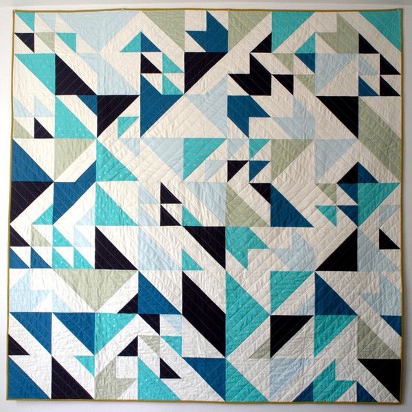
The other obvious comparison would be to the blandest and stiffest images from geometric abstractionism movements or even patchwork geometric quilting.
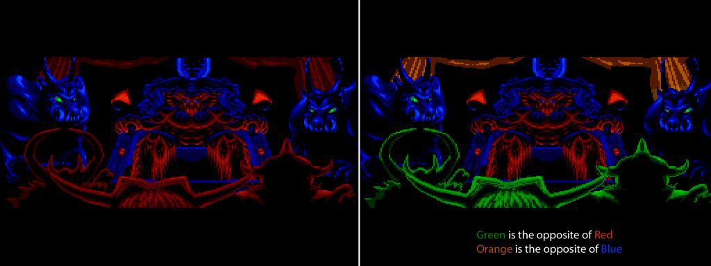
However, the game fails to capture the contrast of great quilting and demonstrates a complete lack of understanding of basic color theory. Below is a demonstration of this.
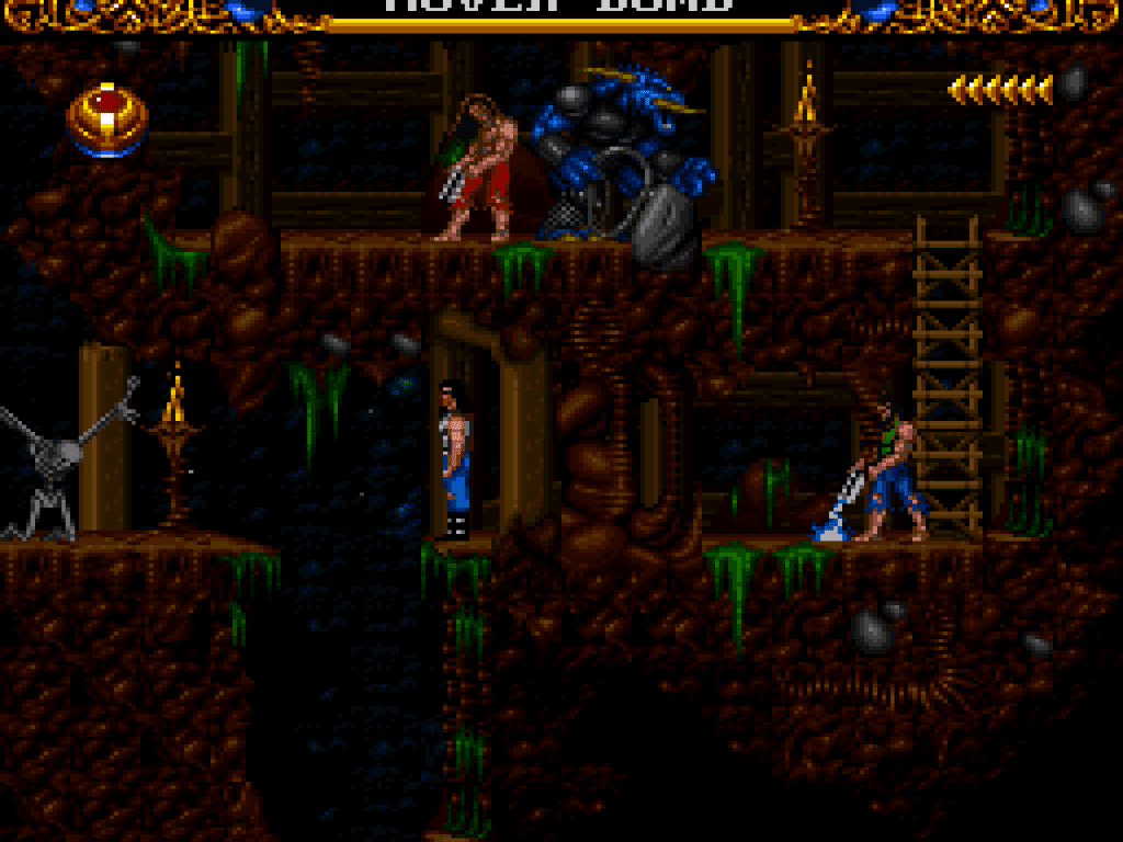
Left: Demons in the Foreground are the same red color as Sarlac’s legs and the back curtains; thus the foreground, middleground, and background are not distinguished from each other. Right: note how the image improves when I artificially alter it introducting the most rudimentary color theory to distinguish a foreground, middleground, and background. The image becomes much more successful. However, the problem is not images appearing flat (if an artist intends this). The problem is that images are flat due to clear and obvious incompetence without purpose.
If the game wanted flatness and geometrics it should have abstracted more and added contrast. If it went full on Cubist Abstractionism it would have done better. Images of Blackthorne are incompetent and unredeemable. There is no silver lining. Throw this game in the garbage.

